
Color impacts your mood and energy more than you realize, influencing how you feel and make choices every day. Bright hues like red or orange can boost alertness and prompt action, while soft shades like blue or green promote calmness and relaxation. By selecting colors intentionally, you can create environments that support your desired emotions and energy levels. Keep exploring how different hues can enhance your daily life and well-being.
Key Takeaways
- Bright red energizes and encourages quick action, ideal for stimulating activity or motivation.
- Soft blue fosters calmness and focus, suitable for relaxing environments or workspaces.
- Vibrant colors like orange or yellow boost energy and attention, enhancing alertness and enthusiasm.
- Neutral tones such as gray or beige promote stability, reliability, and careful decision-making.
- Personal preferences and cultural contexts influence how different hues affect mood and energy levels.
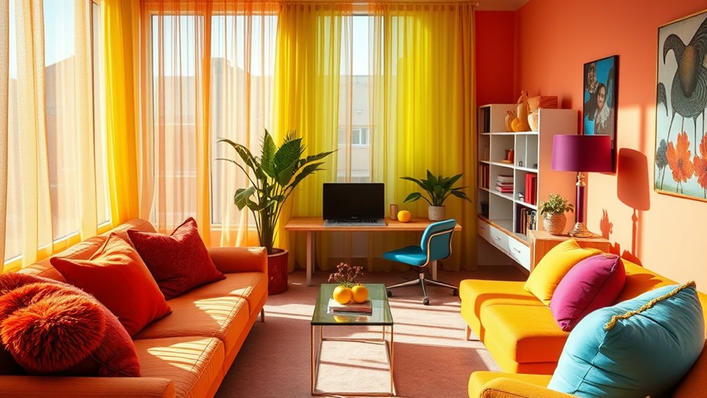
Have you ever wondered how colors influence your emotions and decisions? It’s fascinating how certain hues can evoke specific feelings or reactions without you even realizing it. This phenomenon is rooted in color psychology, which explores the ways color associations shape your emotional responses. When you see a bright red, you might feel energized or prompted to act quickly, while a soft blue can promote calmness and focus. These responses aren’t random; they’re deeply embedded in your subconscious and cultural experiences, making color a powerful tool to influence mood and behavior.
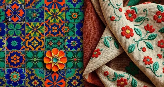
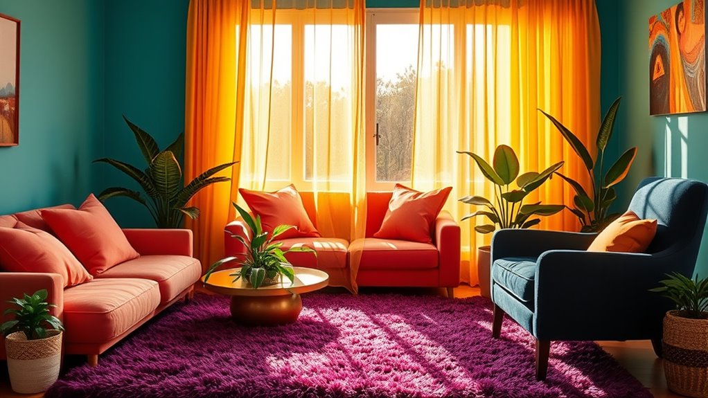
Your emotional responses to colors are often universal but can also vary based on personal and cultural contexts. For example, red might symbolize passion or danger in one culture, while representing luck and celebration in another. This illustrates that color associations are complex, yet they consistently impact how you feel and act. When you’re designing a space or choosing an outfit, understanding these emotional responses can help you create environments that support your mood or intentions. If you want to boost energy in a workspace, incorporating vibrant hues like red or orange can stimulate alertness. Conversely, for a bedroom meant to relax you, softer shades like pastel green or lavender work better, promoting tranquility and rest.
Colors evoke universal feelings, but cultural meanings influence how they impact your mood and choices.
Colors also influence decision-making beyond just mood. When you’re shopping or making choices, the colors used in branding or packaging can subtly guide your preferences. Bright, bold colors often attract attention and can create excitement or urgency, making you more likely to make impulsive purchases. On the other hand, muted or neutral tones tend to suggest sophistication, reliability, or calmness, encouraging you to take your time and consider options carefully. Recognizing these color associations helps you become more aware of how visual cues steer your decisions, whether consciously or subconsciously.
Your understanding of color psychology can extend to your personal life and well-being. By intentionally selecting colors that evoke positive emotional responses, you can enhance your daily experiences. Want to boost your confidence? Wear a striking red shirt. Need to feel more relaxed? Surround yourself with soothing blues or greens. Even your home decor can reflect these principles, creating an environment that aligns with your desired mood. So, next time you’re choosing colors for a project or your wardrobe, remember that these hues carry psychological power, actively shaping your emotional landscape and influencing your decisions in subtle yet profound ways.

QLMX Inhale Exhale Mental Health Wall Art Prints Set of 4, Watercolor Abstract Prints for Wall Decor, Therapy Office Decor, Calming Breathe Poster for Therapy Counselling Room 8”x10” Unframed
Unframed Prints: Our set includes 4 unique wall art prints, each measuring 8×10 inches. Please note, these prints…
As an affiliate, we earn on qualifying purchases.
As an affiliate, we earn on qualifying purchases.
Frequently Asked Questions
How Do Cultural Differences Influence Colour Perception?
You should recognize that cultural differences markedly influence how you perceive colours. Cultural symbolism and regional colour associations shape your emotional responses and interpretations. For example, red might symbolize luck in China but danger in Western countries. These cultural nuances guide your preferences and reactions, making colour perception highly context-dependent. Understanding these variations helps you choose hues that resonate positively across different cultures and avoid misunderstandings.
Can Colour Therapy Improve Mental Health Effectively?
Ever wondered if colour therapy benefits your mental health? It can be effective as part of mental health strategies, helping to reduce anxiety, boost mood, and promote relaxation. By using specific hues, you can create calming environments or energize your mind. While not a standalone cure, colour therapy offers a complementary approach that enhances emotional well-being and supports overall mental health improvement.
What Colours Are Best for Boosting Productivity at Work?
You should choose office color schemes with blues and greens to boost productivity, as they promote focus and calmness. Incorporate bright workspace lighting to energize your environment and reduce fatigue. Avoid overly warm tones like red or yellow, which can cause restlessness. Using balanced hues and proper lighting helps create a workspace that encourages concentration, efficiency, and a positive mood throughout your workday.
How Do Colour Preferences Change With Age?
As you age, your colour preferences tend to shift due to developmental colour studies and age-related changes. You might find brighter, more vibrant hues appealing in childhood, while older adults often prefer softer, muted tones that evoke calm. These preferences are influenced by psychological and physiological factors, so understanding age-related colour preferences helps you select hues that resonate and promote well-being at each life stage.
Are There Colours That Universally Evoke Calmness?
You’ll find that soft blues and greens universally evoke calmness because of their psychological effects and personal associations with nature and tranquility. These hues tend to reduce stress, promote relaxation, and create a soothing atmosphere. While individual experiences vary, these colors are widely recognized for their calming influence, making them ideal choices for spaces where you want to foster peace and emotional balance.

DONFENTHY 4 Pcs Butterfly Wall Decor Blue Room Decor Wooden Positive Decor with Butterfly Inspirational Word Sign for Teen Girls Women Room Bathroom Bedroom Office Decor(Blue,10×4 Inch)
Positive Butterfly Decor Set: you will receive 4 pieces of elegant butterfly wall decor art in 4 different…
As an affiliate, we earn on qualifying purchases.
As an affiliate, we earn on qualifying purchases.
Conclusion
So, next time you pick a wall color, remember you’re not just decorating — you’re secretly plotting your mood and energy levels. Who knew that a splash of red could turn you into a productivity machine, or that blue might make you so calm you forget to get things done? It’s almost like colors have a mind of their own, conspiring to turn your space into a psychological battleground. Choose wisely, or let the hues do the heavy lifting.

Flash Furniture Kelista Mid-Back Red Mesh Swivel Ergonomic Task Office Chair with Flip-Up Arms
MULTIPURPOSE SEATING: Commercial grade office chair with space-saving flip-up arms ideal the front office, executive suite, or at-home…
As an affiliate, we earn on qualifying purchases.
As an affiliate, we earn on qualifying purchases.

DVBOCS A Little Spot And Color Psychology Poster Kid Educational Canvas Print Painting Emotional Management Mental Health Wall Art Decor For Office School Classroom Bedroom Decor 12x16in Unframed
Color Psychology Integration: This unique canvas print leverages the principles of color psychology to engage young minds, making…
As an affiliate, we earn on qualifying purchases.
As an affiliate, we earn on qualifying purchases.